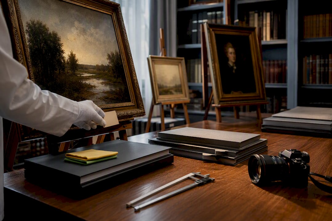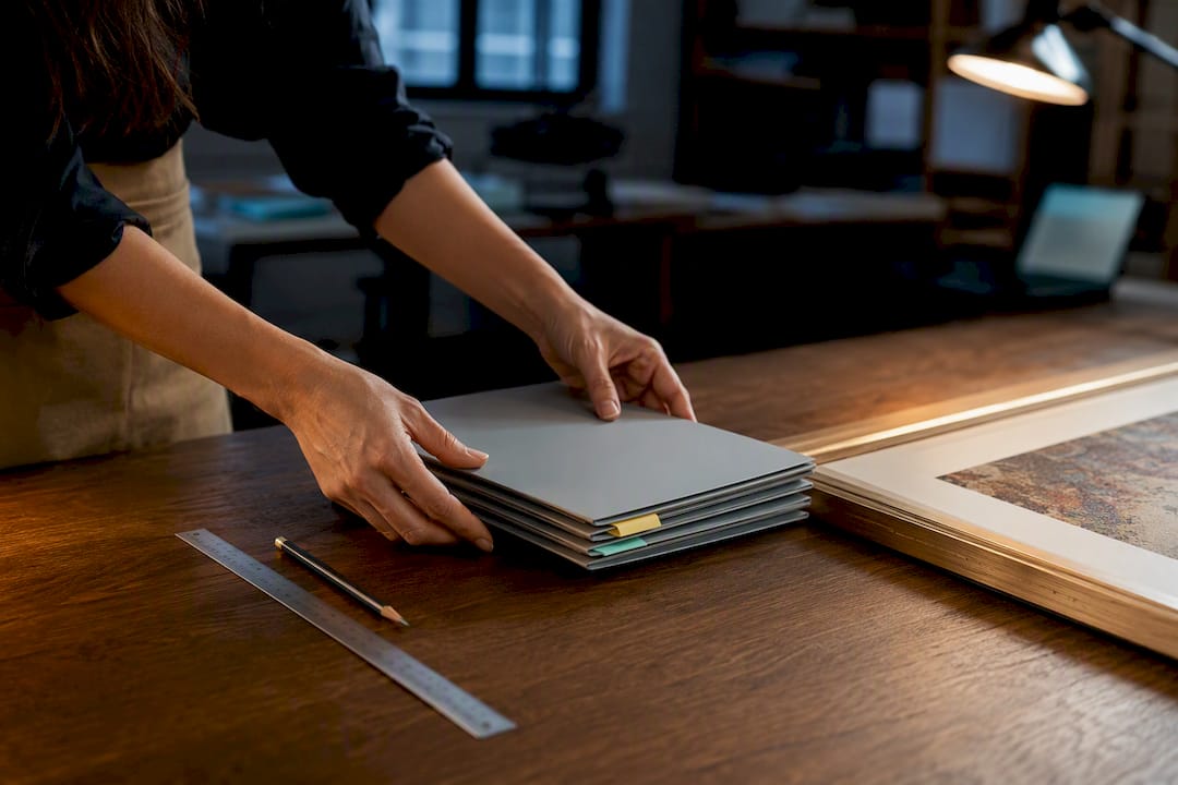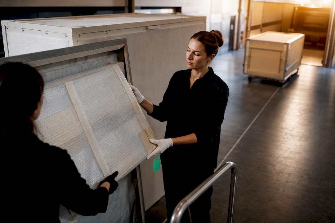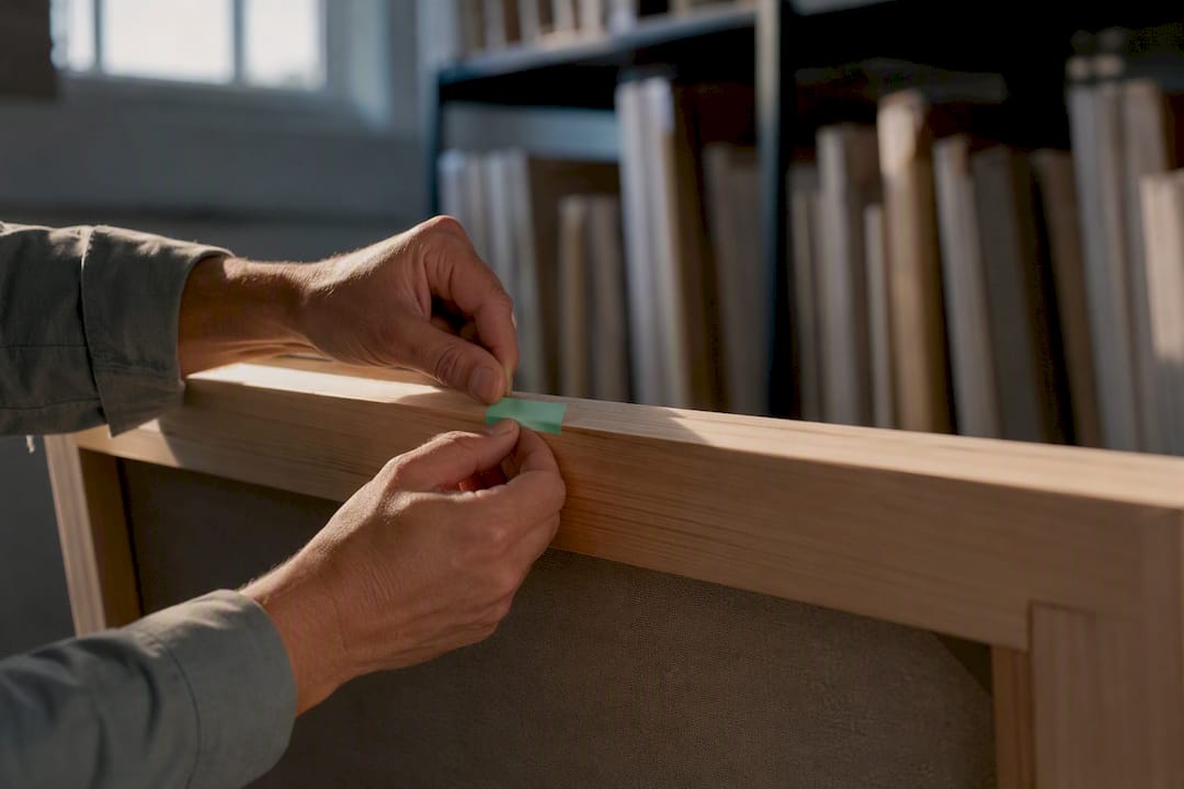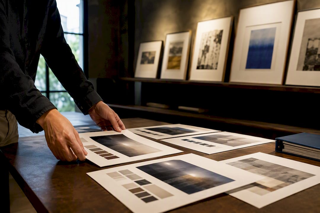


Artwork display layout best practices are the set of spatial, compositional, and lighting principles that determine how viewers experience art in any setting. The museum standard places the center of each artwork at 57–60 inches from the floor, aligning with average adult eye level. Spacing between pieces follows equally clear rules: 2–4 inches for tight clusters and 6–10 inches for looser arrangements. These are not stylistic preferences. They are tested conventions used by major institutions and professional installers to control viewer attention, create visual cohesion, and protect the integrity of each piece.
What are the artwork display layout best practices for height and spacing?
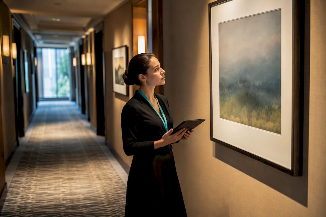
The single most important rule in display layout is center height. Centering artwork at 57–60 inches from the floor is the standard used by major museums worldwide. This measurement places the visual midpoint of the piece at average adult eye level, reducing neck strain and maximizing engagement.
When art hangs above furniture, two additional rules apply. The artwork’s width should span 66%–75% of the furniture’s width to maintain visual proportion. The vertical gap between the top of the furniture and the bottom of the frame should stay within 6–12 inches. A gap wider than 12 inches disconnects the art from the furniture below it, making both elements feel unanchored.
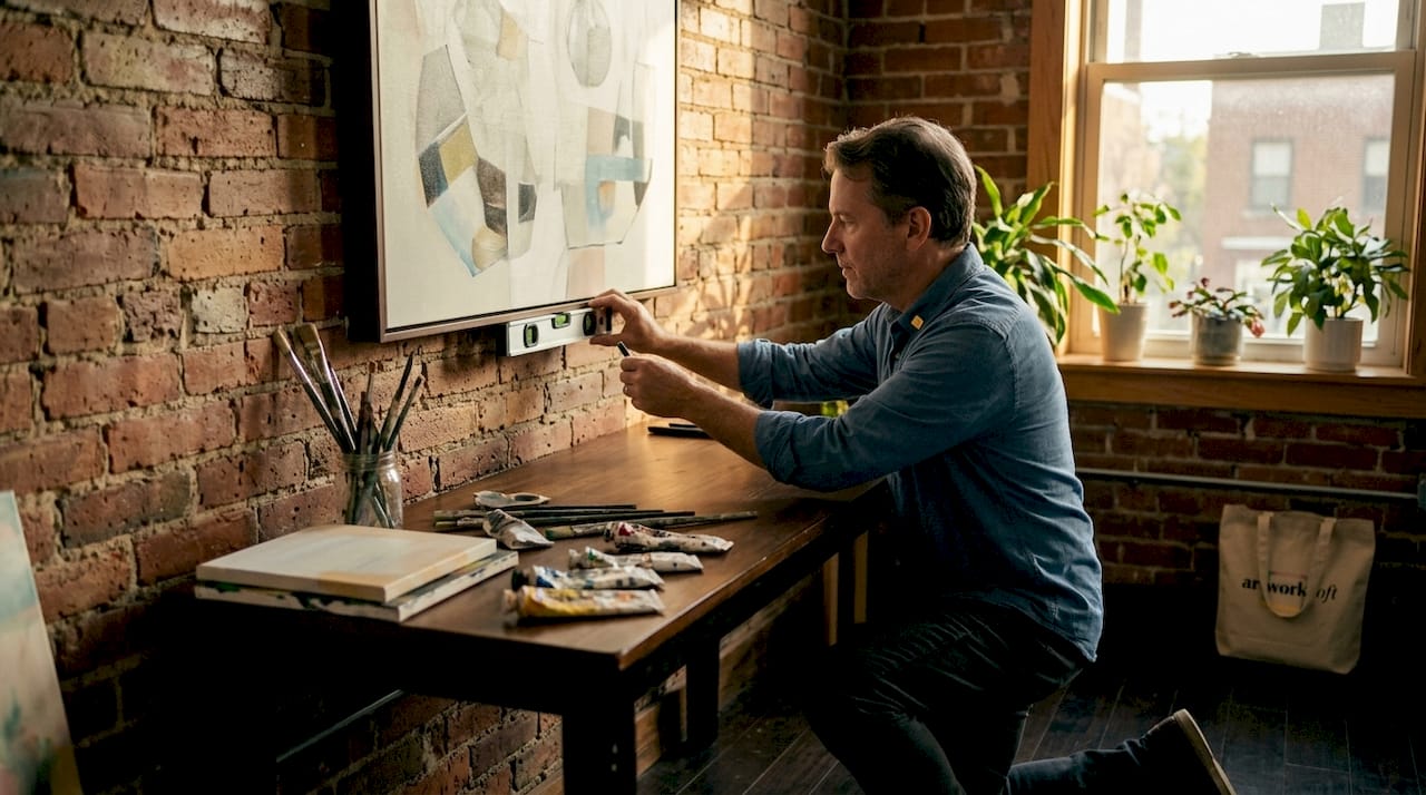
Spacing between individual pieces controls the mood of the entire arrangement. Consistent spacing of 2–4 inches creates a tight, curated cluster that reads as a single composition. Spacing of 6–10 inches produces a looser, more relaxed arrangement where each piece holds its own visual territory. Mixing gap sizes within one grouping is the most common error interior designers identify immediately.
| Scenario | Recommended measurement |
|---|---|
| Center height from floor | 57–60 inches |
| Art width above furniture | 66%–75% of furniture width |
| Vertical gap above furniture | 6–12 inches |
| Tight cluster spacing | 2–4 inches between frames |
| Loose arrangement spacing | 6–10 inches between frames |
Pro Tip: If your ceiling height exceeds 10 feet, resist the urge to raise the center height above 60 inches. Keep art at eye level and let the wall breathe above it.
How should you group and arrange artwork for maximum visual impact?
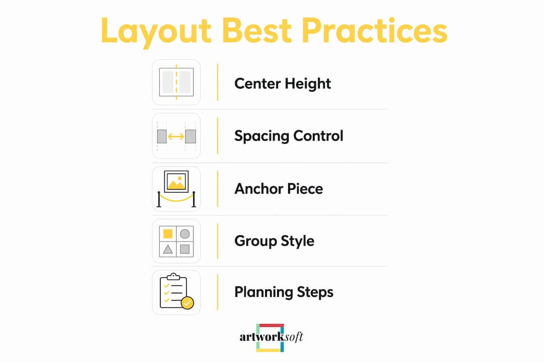
Every successful gallery wall or exhibition grouping starts with an anchor piece. Without a single clear anchor, a grouping lacks hierarchy, and the viewer’s eye has no starting point. The anchor is typically the largest or most visually dominant artwork in the set. All other pieces arrange around it.
Frame size variation is equally critical. Using three or more different frame sizes within a grouping adds compositional depth. Identical frame sizes create a repetitive, wallpaper-like effect that flattens the visual interest of even strong artwork. Mixing small, medium, and large frames gives the eye a natural path to follow.
Four layout styles cover most display scenarios:
- Grid layout: Frames of equal or similar size arranged in precise rows and columns. Works best in formal or minimalist spaces where order is the aesthetic.
- Salon style: A dense, floor-to-ceiling arrangement with varied sizes and orientations. Common in historic European galleries and maximalist interiors.
- Asymmetric clusters: Organic groupings anchored by one large piece, with smaller works radiating outward. The most forgiving format for mixed collections.
- Horizontal rows: Two or three pieces aligned along a shared center line. Ideal for hallways, above sofas, or in narrow spaces.
The choice between these styles depends on the space, not personal preference alone. A hallway calls for a horizontal row or tight vertical stack. A large living room wall can support salon style. An exhibition gallery with multiple walls benefits from asymmetric clusters that create rhythm as visitors move through the space.
Pro Tip: Before committing to a layout style, photograph the empty wall and sketch your arrangement over the image. This takes five minutes and prevents hours of unnecessary patching.
What planning steps prevent the most common installation mistakes?
Planning on the floor before touching the wall is the single most effective installation technique. Professionals spend 10–30 minutes arranging pieces on the floor in a space sized to match the target wall. This reveals spacing problems, proportion mismatches, and anchor placement errors before any hardware goes into the wall.
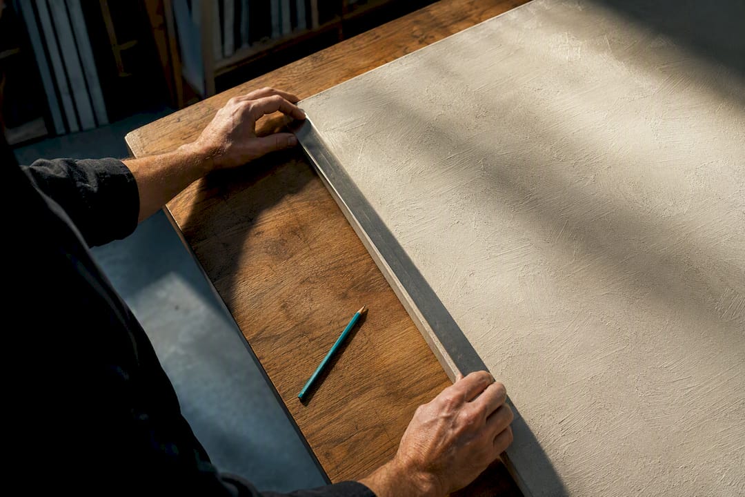
Paper templates are the next step. Trace each frame onto kraft paper, cut out the shape, and tape the templates to the wall with painter’s tape. This method lets you test the exact arrangement at full scale without committing to nail holes. Adjust the templates until the layout is correct, then mark the hanging points through the paper.
Final placement adjustments are always necessary after artwork arrives in a space. Glare angles, sightlines, and the physical presence of the art itself reveal problems that no floor plan or digital mockup can predict. Scheduling time for final tweaks after installation is not optional. It is a professional standard in gallery exhibition planning.
The most common installation mistakes follow a predictable pattern:
- Hanging too high. Art mounted above 60 inches at center forces viewers to look up, breaking the natural viewing experience.
- Inconsistent spacing. Uneven gaps ranging from 1 inch to 6 inches within one grouping destroy visual cohesion and signal an unfinished installation.
- No anchor point. Starting with small pieces and adding larger ones later creates a grouping with no clear focal point.
- Overcrowding. Filling every inch of wall space eliminates the breathing room that makes individual pieces readable.
- Ignoring lighting. Glare from overhead fixtures or windows can render a well-placed piece nearly invisible. Test lighting before finalizing placement.
How do you adapt display layouts to different spaces and collections?
The 57–60 inch center height rule applies to standing viewers. Spaces designed primarily for seated occupants, such as dining rooms or reading rooms, call for a lower center height of 54–56 inches. Tall ceilings in loft spaces or commercial galleries do not require raising the art. They require more deliberate use of negative space above the grouping.
Adapting art to wall and furniture scale is non-negotiable. A small canvas on a large wall reads as an afterthought. A large canvas above a narrow console table overwhelms the furniture. The 66%–75% width ratio applies across all furniture types, from sofas to sideboards.
Key adaptations by space type:
- Hallways: Use horizontal rows or vertical stacks. Keep spacing tight at 2–4 inches. Avoid large pieces that block sightlines.
- Large gallery walls: Build rhythm by repeating a consistent spacing interval across the entire wall. Rhythm is what makes a large installation feel intentional rather than random.
- Small rooms: Limit groupings to three to five pieces. One large anchor piece with two smaller companions reads better than eight small pieces competing for attention.
- Mixed media displays: Combining framed works with three-dimensional objects such as ceramics or sculptural pieces adds organic texture. Place three-dimensional objects at the base of a grouping to ground it visually.
Professional exhibition spaces require additional planning beyond aesthetics. Visitor flow, crate transport routes, climate controls, and security placement all affect where and how artwork can be positioned. These factors belong in the layout plan from the start, not as afterthoughts once installation begins. Artworksoft supports this level of planning by connecting artwork profiles to location data, making it easier to track placement decisions across multiple exhibition spaces.
| Space type | Key adaptation |
|---|---|
| Seated rooms | Lower center height to 54–56 inches |
| Hallways | Horizontal rows, tight 2–4 inch spacing |
| Large gallery walls | Consistent spacing interval for rhythm |
| Small rooms | Limit to 3–5 pieces; one anchor |
| Mixed media | Ground 3D objects at base of grouping |
Key takeaways
Effective artwork display layout requires consistent center height, deliberate spacing, a clear anchor piece, and space-specific adaptations applied before a single nail enters the wall.
| Point | Details |
|---|---|
| Center height standard | Hang artwork with its center at 57–60 inches from the floor for optimal eye-level viewing. |
| Spacing consistency | Use 2–4 inches for tight clusters or 6–10 inches for loose arrangements; never mix gap sizes. |
| Anchor piece first | Identify the largest or most dominant piece and build all groupings outward from it. |
| Plan before hanging | Arrange pieces on the floor and use paper templates on the wall before committing to hardware. |
| Adapt to the space | Adjust center height, scale, and grouping size based on ceiling height, furniture, and visitor flow. |
What I’ve learned from years of watching layouts succeed and fail
The rules covered here are real and worth following. But the most consistent mistake I see is treating them as a checklist rather than a framework. Artists and collectors often hang everything correctly by the numbers and still end up with a wall that feels wrong. The reason is almost always hierarchy. The anchor piece is too small, or there is no anchor at all. The eye enters the grouping and finds nothing to hold onto.
The second pattern I see is perfectionism at the planning stage and impatience at installation. People spend hours arranging paper templates, then rush the final hang and skip the adjustment step. Final placement tweaks after art arrives are where the real work happens. Glare, sightlines, and the physical weight of the piece in the room all reveal things that templates cannot. Build that time into every installation, without exception.
The third thing I would tell any gallery owner or collector is to document your standards. Once you find a spacing interval and center height that works for your space, write it down. Record which arrangements succeeded and why. Artworksoft’s artwork profile management tools make this practical by linking display notes directly to individual artwork records. Repeatability is what separates a professional installation program from a series of one-off experiments.
Experiment within the framework. The grid, salon, and asymmetric cluster styles are not competing philosophies. They are tools. Use the one that fits the wall, the collection, and the viewer experience you want to create.
— Nealda
How Artworksoft supports your display planning and documentation
Executing a well-planned display layout is only half the work. Maintaining records of what was placed where, under what conditions, and with what results is what turns a single successful installation into a repeatable process.

Artworksoft connects each artwork’s profile to its location history, condition notes, and display documentation in one place. Artists, collectors, and gallery owners can use the free art inventory system to catalog pieces, record placement decisions, and generate professional documentation for each exhibition. The platform’s art gallery services extend this further, supporting full exhibition planning from initial layout through final installation records. Every detail stays attached to the artwork, not scattered across emails and spreadsheets.
FAQ
What height should artwork be hung at?
The center of the artwork should sit 57–60 inches from the floor. This aligns with average adult eye level and is the standard used by major museums.
How much space should be between framed pieces?
Use 2–4 inches between frames for a tight, cohesive cluster. Use 6–10 inches for a looser arrangement where each piece reads independently.
What is an anchor piece in a gallery wall?
An anchor piece is the largest or most visually dominant artwork in a grouping. It establishes the focal point and determines where all other pieces are positioned around it.
How do I plan a gallery wall without damaging the wall?
Arrange all pieces on the floor first to test spacing and composition. Then trace each frame onto paper, cut out the templates, and tape them to the wall with painter’s tape before marking any nail holes.
How do I adapt artwork display layouts for small rooms?
Limit groupings to three to five pieces and use one strong anchor piece. Avoid filling the entire wall. Negative space makes individual works more readable in tight spaces.