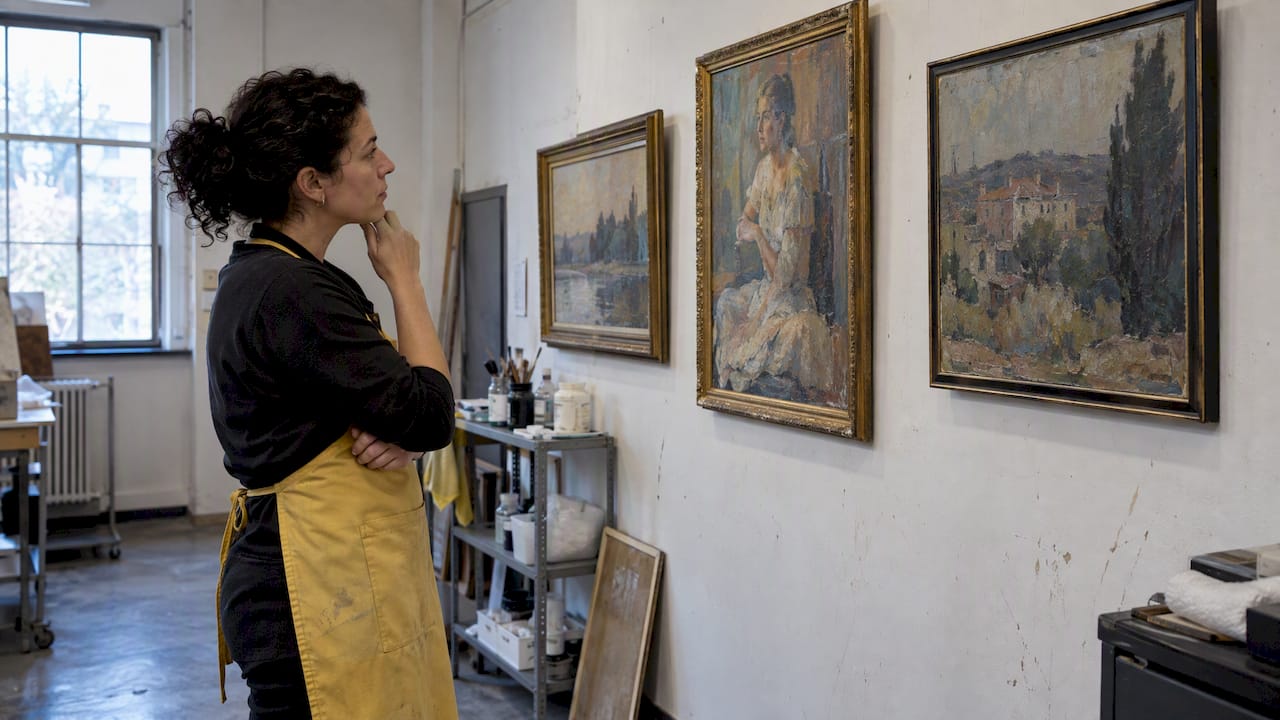

Visual brand identity is the complete system of visual signals an art business uses to communicate its values, style, and professional standing to collectors, galleries, and clients. A well-built visual brand does more than look polished. It shortens the time a collector needs to trust you, and trust is what converts interest into a sale. This art business visual branding guide covers the foundational elements every emerging artist needs: logo, color palette, typography, portfolio structure, and the metrics that make pitch decks credible. The goal is a brand that puts your artwork first and your business second, in the best possible way.
What core elements make up an effective visual brand for an art business?
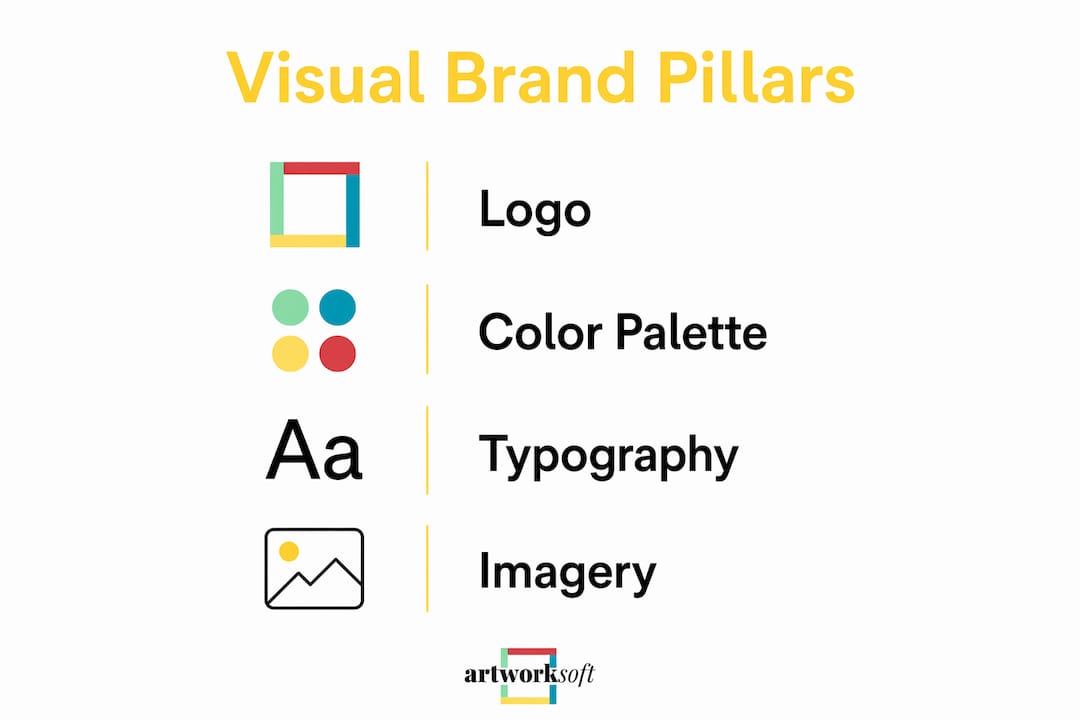
The four pillars of art business visual identity are logo, color palette, typography, and imagery. Each one carries a specific job. Your logo identifies you. Your color palette creates emotional consistency. Your typography signals your level of professionalism. Your imagery, meaning the photographs and presentation of your actual work, is the primary brand asset.

The most common mistake artists make is treating these four elements as decoration. They are communication tools. A logo that competes with your artwork for visual attention is already failing. The same applies to a color palette with six competing tones or a font that reads as playful when your work is serious and architectural.
Brand clarity on values and audience must come before any visual design decision. That means writing down three adjectives that describe your artistic practice, three that describe your ideal collector, and three that describe the feeling you want your brand to produce. Those nine words become your design brief.
- Logo: Keep it simple. A wordmark in a clean typeface often outperforms a complex icon for artists because it stays legible at small sizes on social media profiles and email signatures.
- Color palette: Pick 3 dominant colors and assign each a role: primary, secondary, and accent. This prevents visual drift across platforms.
- Typography: Use two typefaces maximum. One for headings, one for body text. Mixing three or more creates visual noise.
- Imagery: Invest in professional photography of your work. A single high-quality image of one painting communicates more than twelve mediocre shots.
Pro Tip: Write your brand adjectives before you open any design software. If you cannot describe your brand in three words, no designer or template will solve that problem for you.
How to build and organize your art portfolio and website to support your visual brand
A portfolio website is the most important sales tool an emerging artist controls. It works around the clock, reaches collectors in every time zone, and sets the first impression before any in-person meeting. The structure of that website determines whether a visitor becomes a buyer or clicks away.
A 7-part website hierarchy produces the strongest results for artists. Each section serves a specific function in moving a visitor from curiosity to contact.
- Hero image: One full-width photograph of your strongest work. No text overlay. No slideshow. One image, full confidence.
- Short mission statement: A 25-word sentence that tells visitors who you are, what you make, and why it matters. This is the hardest sentence you will write and the most important.
- Selected works gallery: Eight to twelve pieces that represent your current direction. Not your full archive. Your best current work.
- Full catalog: A searchable or browsable archive for serious collectors who want depth. This is where organized art portfolio management pays off directly.
- Press and shows: Exhibition history, reviews, and media mentions. This section builds credibility fast. An empty press page signals an early-career artist. A populated one signals a working professional.
- Shop: Direct sales capability, even if you only list prints or smaller works. Removing friction from the purchase path increases conversion.
- Contact: A simple form and your professional email. No phone number required unless you want calls.
Write two versions of your artist statement: a 25-word mission for your homepage and bio fields, and a full statement for your About page. The short version does the work of first contact. The long version closes the deal with serious collectors.
Pro Tip: Update your press and shows section every time you exhibit, even in a group show. Collectors and curators check this section to assess activity level. A stale press page reads as inactivity, not modesty.
What practical tools and guidelines help maintain brand consistency across all channels?
Brand consistency is the single most underrated factor in art business growth. Consistent visual, verbal, and social branding reduces the cognitive effort audiences need to recognize and remember you. In a crowded market, recognition is revenue.
The most practical tool for maintaining consistency is a one-page identity sheet. This document does not require design software or a professional designer. It contains three things: your three brand colors with their hex codes, your three recurring visual motifs, and your logo in three scale options (large, medium, and small). A one-page identity sheet becomes the filter for every design decision you make, from Instagram posts to exhibition signage.
| Channel | Consistency requirement | Common mistake |
|---|---|---|
| Website | Colors, fonts, and imagery match identity sheet | Using stock photography that conflicts with your palette |
| Social media | Same profile image, consistent caption tone | Switching between formal and casual voice week to week |
| Print materials | Logo at correct scale, colors match digital hex values | Printing colors that drift from screen values without proofing |
| Email signature | Wordmark, title, and one link only | Overloading with multiple logos and social icons |
| Exhibition materials | Consistent label format and artist statement version | Using different bio lengths on different materials |
The verbal layer of your brand matters as much as the visual layer. Your captions, bio descriptions, and email tone should all carry the same register. If your artwork is contemplative and serious, your Instagram captions should not read as casual or humorous. Mismatched verbal and visual signals create confusion, and confused audiences do not buy.
Pro Tip: Create a folder on your computer labeled “Brand Assets” and store your identity sheet, logo files, and approved photography there. Every time you need to post, pitch, or print, pull from that folder. This single habit eliminates most consistency errors.
How to leverage visual branding in art business pitch decks and sponsorship proposals
A pitch deck for an art business is not a portfolio presentation. It is a business document that happens to contain images. Galleries, sponsors, and institutional buyers read pitch decks to assess risk and return. Your visual brand signals professionalism. Your data signals viability.
Verifiable metrics are the difference between a pitch that gets a response and one that gets filed away. Vague language like “significant social following” or “strong community presence” carries no weight. Specific numbers do.
- Include exact audience figures: newsletter subscribers, monthly website visitors, social media reach by platform.
- Quantify exhibition exposure: total visitor counts, demographic breakdowns where available. An exhibition with 12,000 visitors where 68% are ages 28–45 tells a sponsor exactly who their logo reaches.
- Specify placement: logo on printed materials with a stated print run, digital ad reach with a stated impression count.
- Use your brand colors and typography throughout the deck. A pitch deck that looks different from your website signals disorganization.
- Keep the deck to 10–12 slides. Every slide should answer one question a sponsor or gallery director would actually ask.
Building a credible business profile with verified metrics is a skill. The art business profile guide from Artworksoft covers how to structure and present that data effectively.
“Sponsors and galleries are not buying your artwork in a pitch meeting. They are buying your audience and your credibility. Numbers prove both. Visuals support both. Neither works without the other.”
What are common pitfalls in art business visual branding and how to avoid them?
The most damaging mistake in art business branding is starting with the logo. A logo is the last step in a brand process, not the first. Designing a logo before you have defined your values, audience, and positioning produces a mark that looks fine but communicates nothing specific.
- Treating the logo as the entire brand: Your logo is one element. Your brand is the sum of every interaction a collector has with your business, from your website to your email tone to how you package a sold piece.
- Overloading the website with graphics: Minimal branding keeps the focus on your artwork. Decorative borders, animated elements, and competing color blocks push the work into the background.
- Inconsistent messaging across platforms: If your website bio says you work in abstract painting and your Instagram bio says you are a mixed-media artist, collectors cannot categorize you. Categorization is how they remember you and refer you to others.
- Ignoring the business goals in brand decisions: Every brand element should serve a specific business outcome. If your goal is gallery representation, your brand should signal seriousness and curatorial coherence. If your goal is direct collector sales, it should signal accessibility and clear pricing.
- Skipping the strategy phase: Defining values and audience before designing visuals is not optional. It is the only sequence that produces a brand that works.
The corrective is restraint. Focus on one to two key projects as your primary brand signal. Let those projects define your visual identity, not the other way around.
Key Takeaways
A strong art business visual brand requires strategy before design, consistency across every channel, and measurable data in every pitch.
| Point | Details |
|---|---|
| Strategy before visuals | Define your values, audience, and brand adjectives before designing any visual element. |
| Minimalism protects artwork | Keep branding clean and restrained so your artwork remains the primary visual focus. |
| Seven-part website structure | Use hero image, mission, selected works, catalog, press, shop, and contact to convert visitors. |
| One-page identity sheet | Document three colors, three motifs, and three logo scales to maintain consistency across all channels. |
| Metrics win pitches | Replace vague language with specific audience numbers and placement data in every sponsorship deck. |
Why I think most artists get branding backwards
Artists spend weeks choosing a logo font and an afternoon on brand strategy. That ratio is exactly wrong. I have reviewed dozens of artist websites and pitch decks over the years, and the ones that land gallery shows and sponsorships share one quality: clarity. Not beautiful design. Clarity. The artist knows who they are, who they are talking to, and what they want the viewer to do next.
The artists who struggle with branding are almost always the ones who built the visual layer first. Their websites look polished but feel generic. Their pitch decks are beautifully laid out but contain no numbers a sponsor can act on. The brand looks like a brand but does not function like one.
My honest recommendation is to spend the first week of any branding effort writing, not designing. Write your brand adjectives. Write your 25-word mission statement. Write a description of your ideal collector. Then, and only then, open a design tool. The visual decisions become obvious once the strategic ones are made. Artwork leads. Everything else supports it.
— Nealda
How Artworksoft supports your art business brand and operations
Building a credible art business brand requires more than good design. It requires organized, accurate records of your inventory, sales, and artwork documentation. That is where Artworksoft fits into the picture.
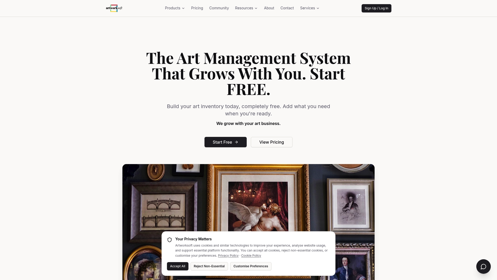
Artworksoft provides a free art inventory system that connects your artwork profiles, locations, and transaction history in one place. When you need to build a pitch deck with verified metrics, your sales data and exhibition records are already organized. When a collector asks for provenance documentation, your Certificates of Authenticity are ready. Artworksoft also supports artwork profile management, so every piece in your catalog carries consistent metadata and imagery. A well-documented inventory is the operational foundation that makes every branding effort more credible.
FAQ
What is visual branding for an art business?
Visual branding for an art business is the system of logo, color palette, typography, and imagery that communicates an artist’s identity and professional standing. It works across websites, social media, print materials, and pitch decks.
What should an art business website include?
An art business website should include a hero image, a 25-word mission statement, a selected works gallery, a full catalog, press and exhibition history, a shop, and a contact form. This seven-part structure moves visitors from discovery to purchase efficiently.
How do I maintain brand consistency across platforms?
Create a one-page identity sheet with your three brand colors, three visual motifs, and logo in three scale options. Use this sheet as the filter for every design decision across social media, print, and web.
What metrics should I include in an art business pitch deck?
Include exact subscriber counts, exhibition visitor numbers with demographic data, and specific placement figures such as logo on a stated number of printed materials or digital ads reaching a stated impression count. Specific numbers replace vague claims and build sponsor trust.
When should I start designing my art business logo?
Design your logo after you have defined your brand values, audience, and positioning in writing. Starting with the logo before completing the strategy phase produces a mark that looks professional but communicates nothing specific about your practice.